Just The Remedy
Packaging + Logo Design
Just the Remedy is a tea company that encourages customers to reclaim their health through holistic herbal remedies.
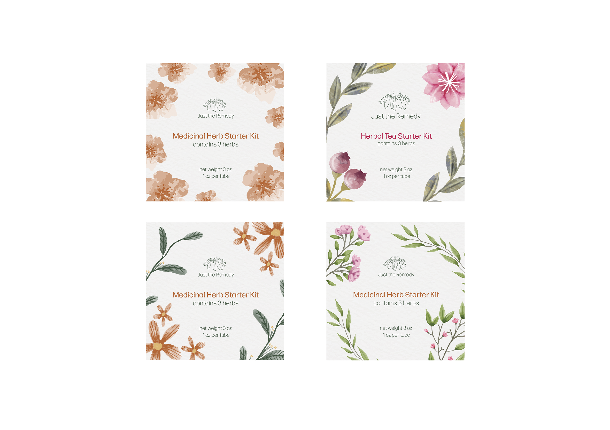
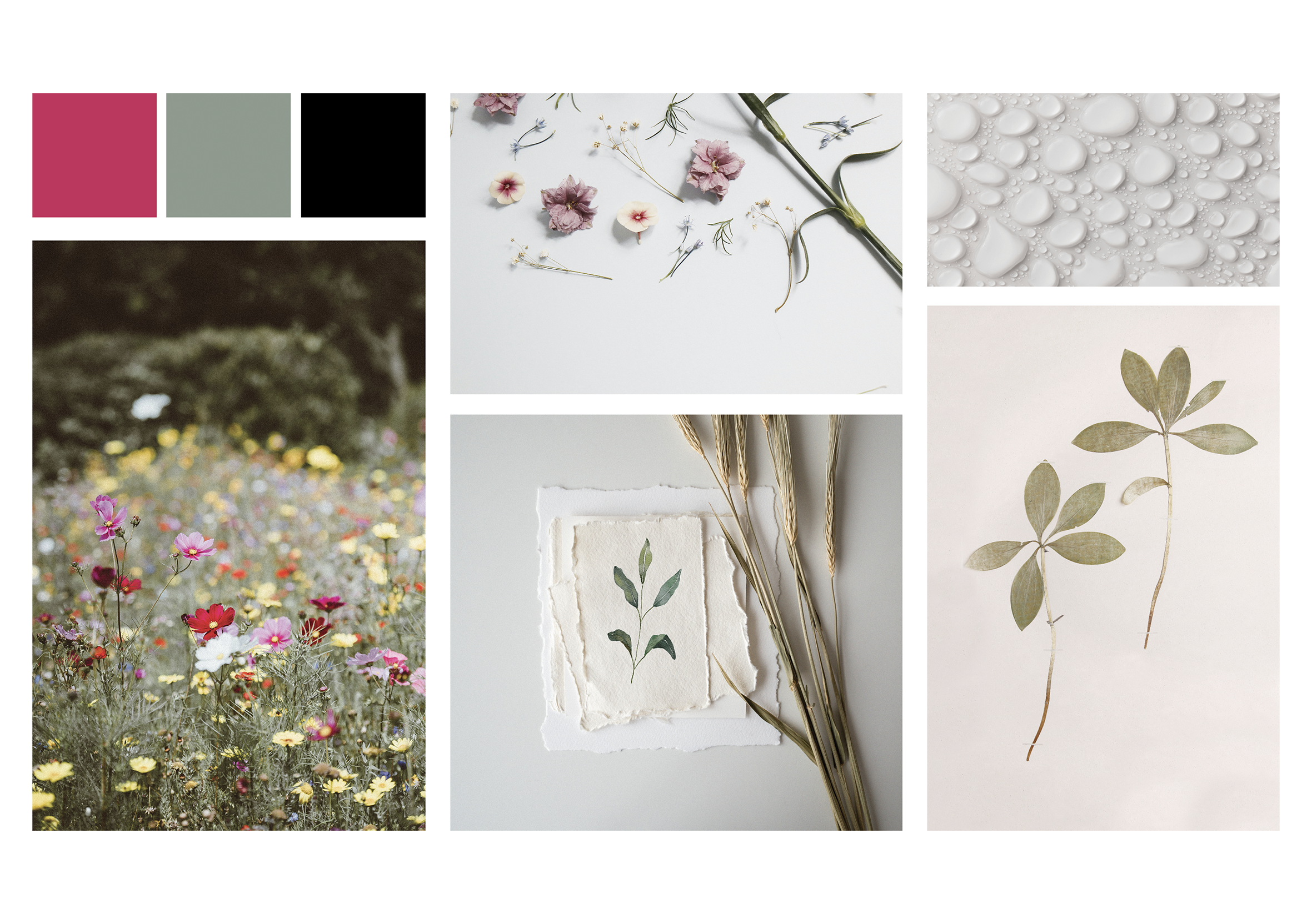
For this project, I revamped their branding with a new logo, packaging design, and product labels. Sustainability and health are a big focus for my client, so we opted for a vibrant reddish raspberry hue and floral motifs to create a package that is both eye-catching and reflects their values.
Logo illustration by Xinh Beardmore
www.xinhnie.com
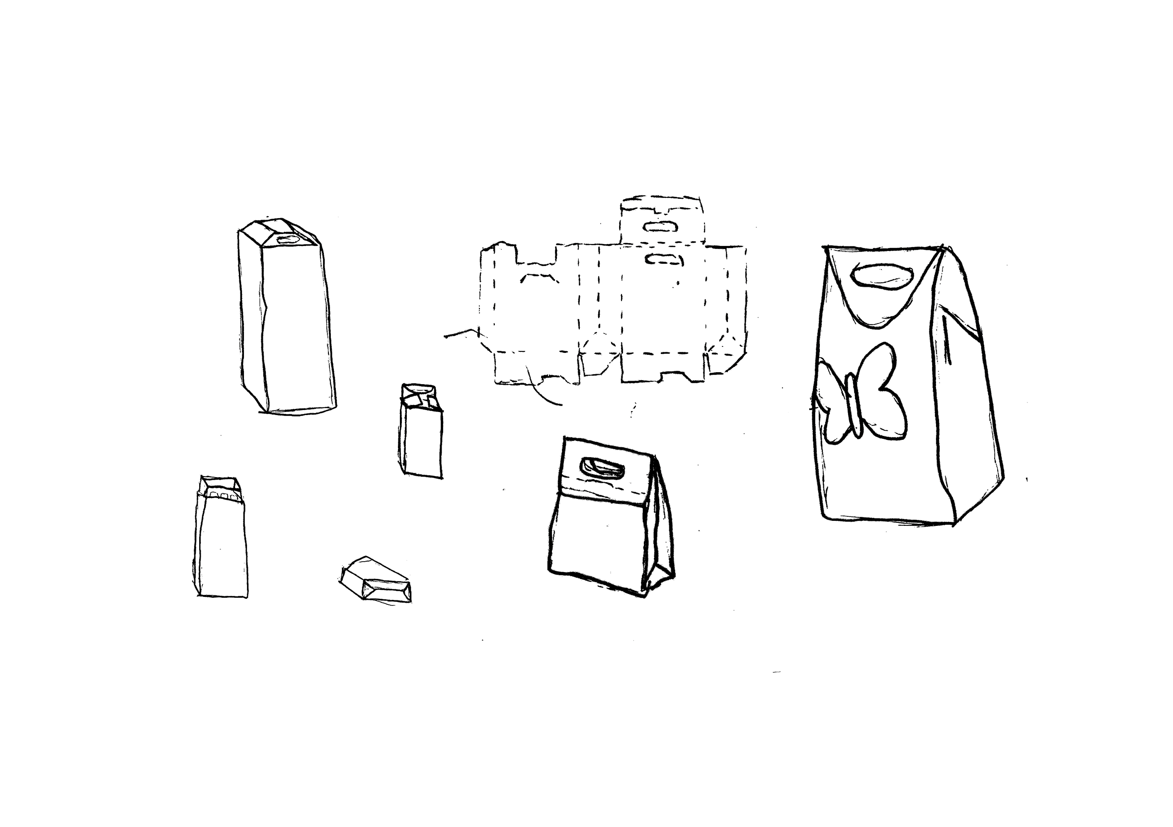
Sketching + Concepting
It was important for my package to be sustainable because that is one of Just The Remedy’s core values.
I knew my package needed a thin ply to make it easily recyclable, so I designed the structure with this in mind.
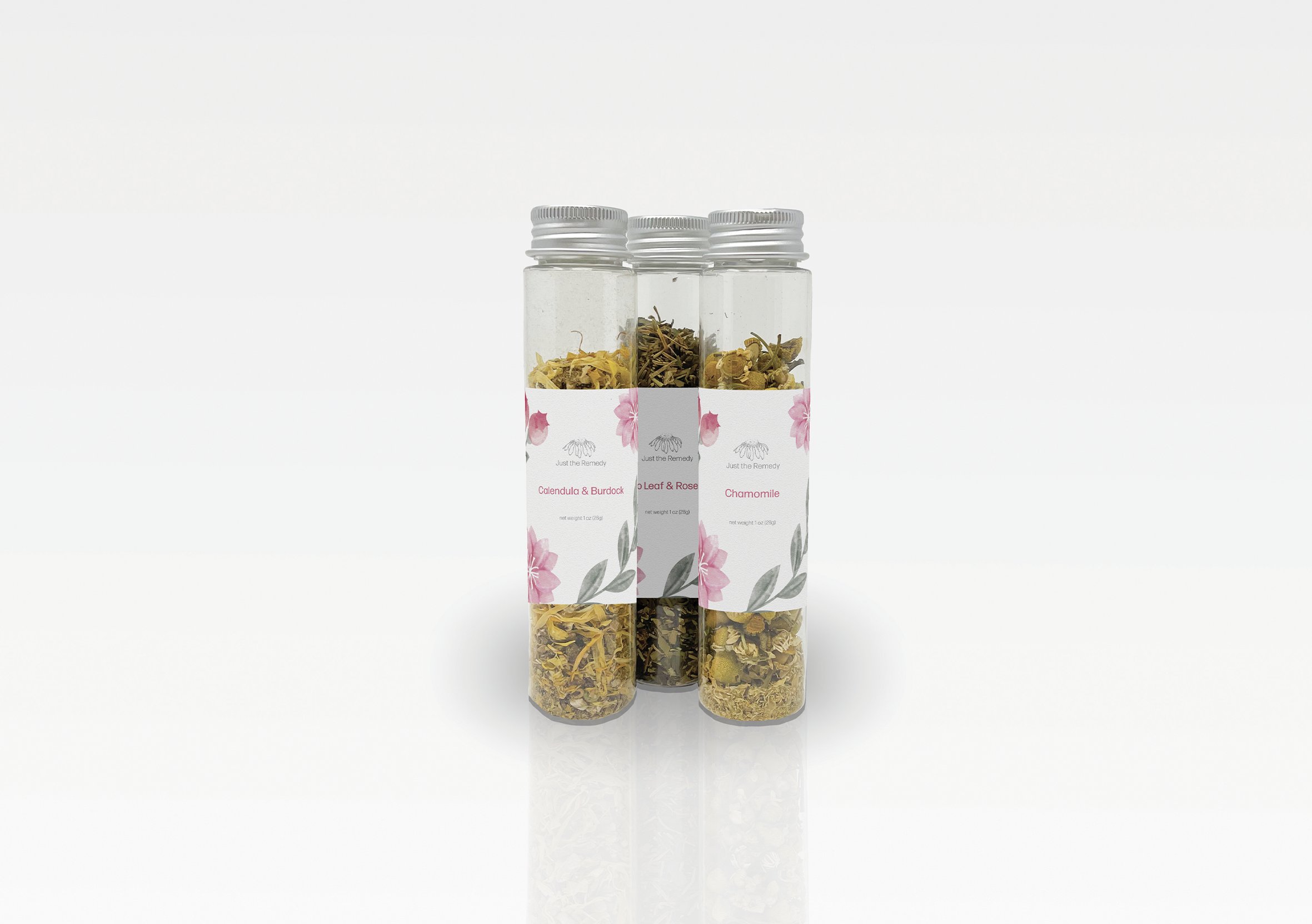
I was working with 3 tubes of herbal teas - a multipack that allows customers to try several different blends and get their foot in the company’s door.
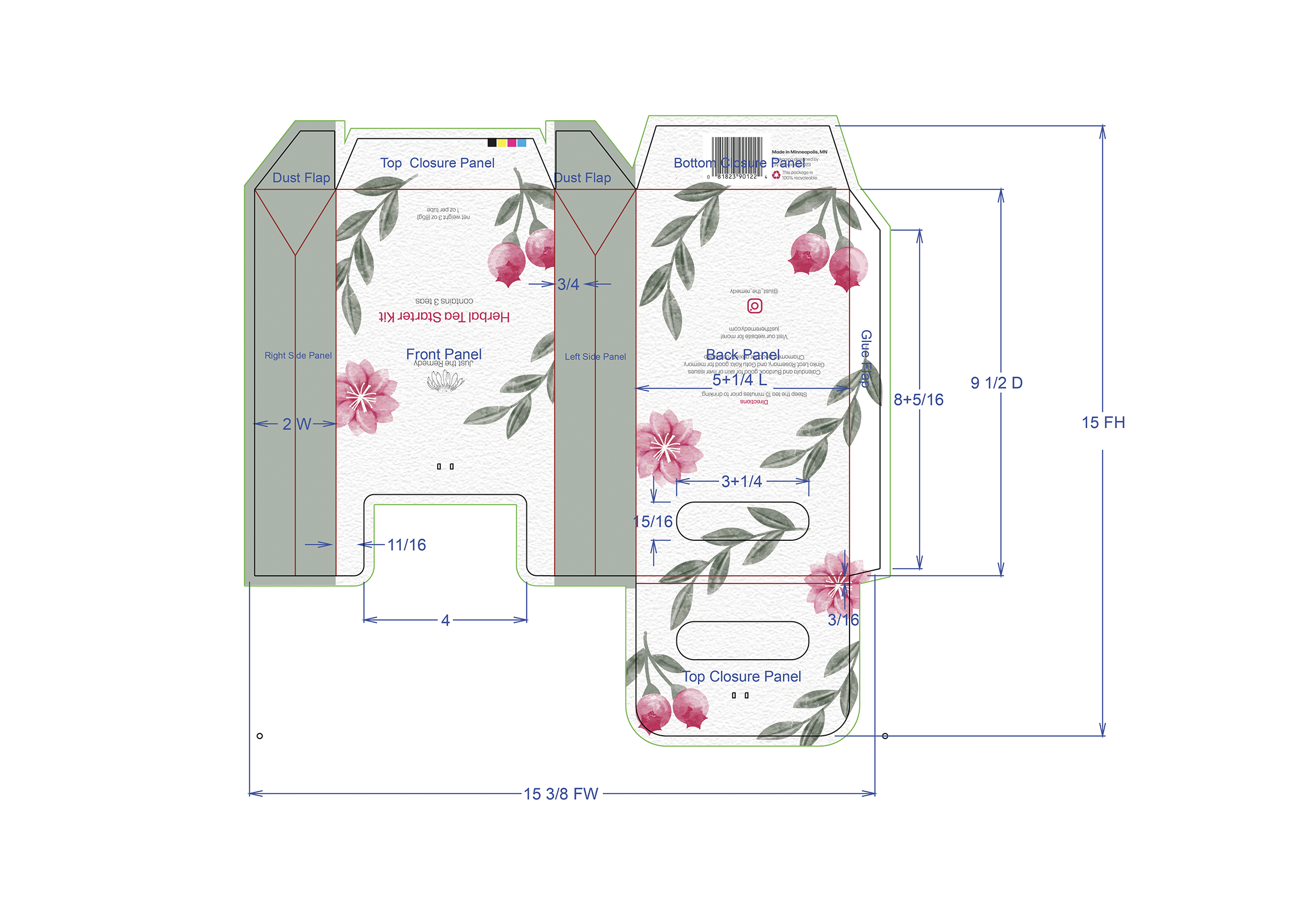
Dieline + Design
I created the dieline in ArtiosCAD. My college, Dunwoody had a CAD table, where I was able to concept and test my structure. After experimenting with over a dozen prototypes, I landed on this final design.
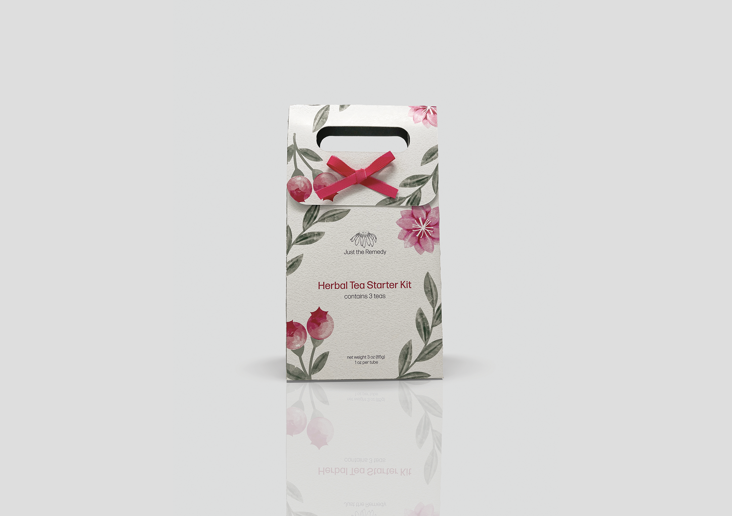
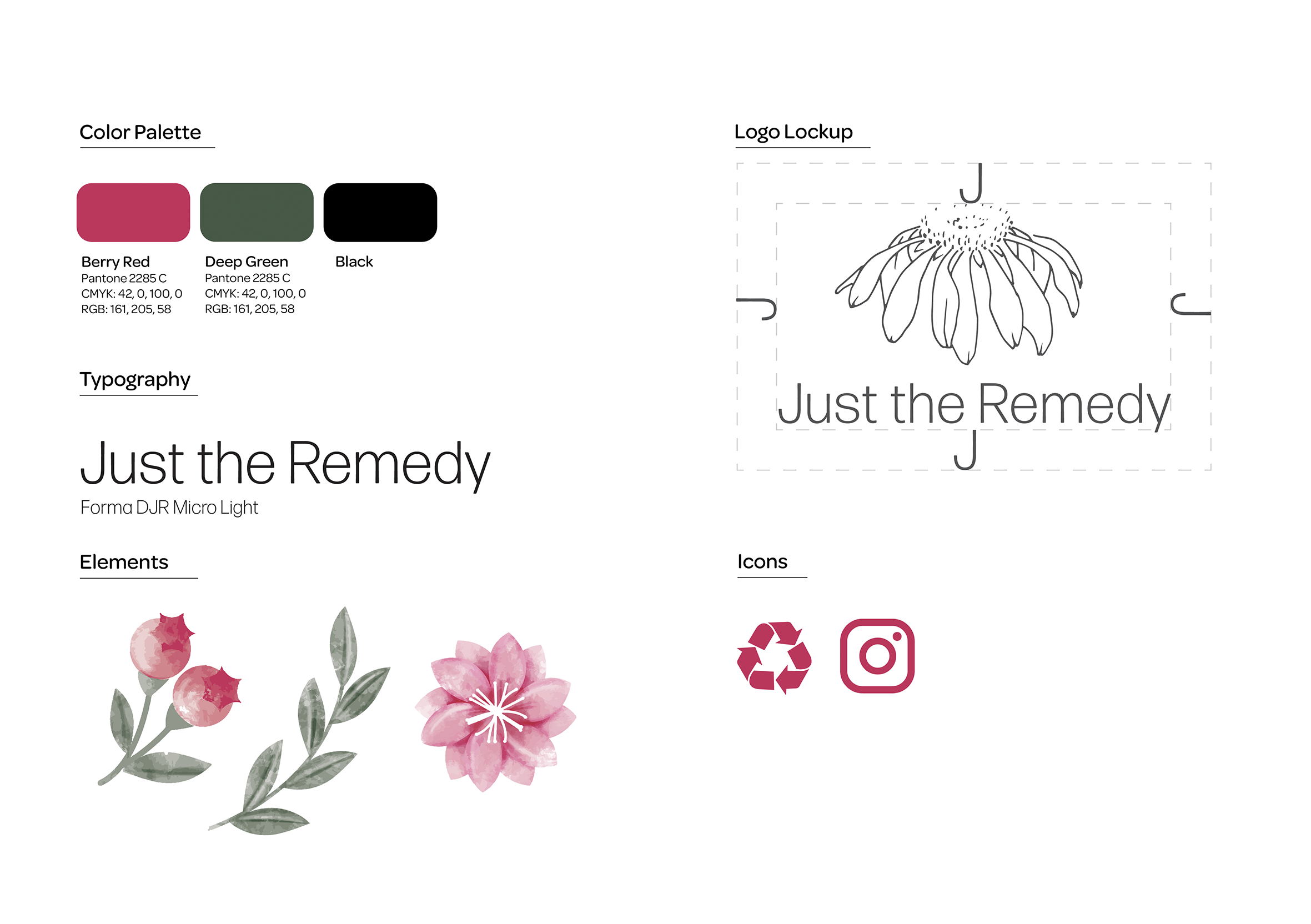
I worked with my client from Just The Remedy to choose the berry red color for the watercolor vectors. It even had personal connection for her, as it was the color of her favorite flower: the Echinacea - which also appears in her logo.
To maintain sustainability, the closure mechanism I used was a small pink reusable ribbon strung through the package and tied into a bow.
This brand wants to convey their values of holistic medicine, home gardening, and sustainability. The design was meant to be light and airy, resembling the natural leaves and flowers used in each
herbal tea blend.