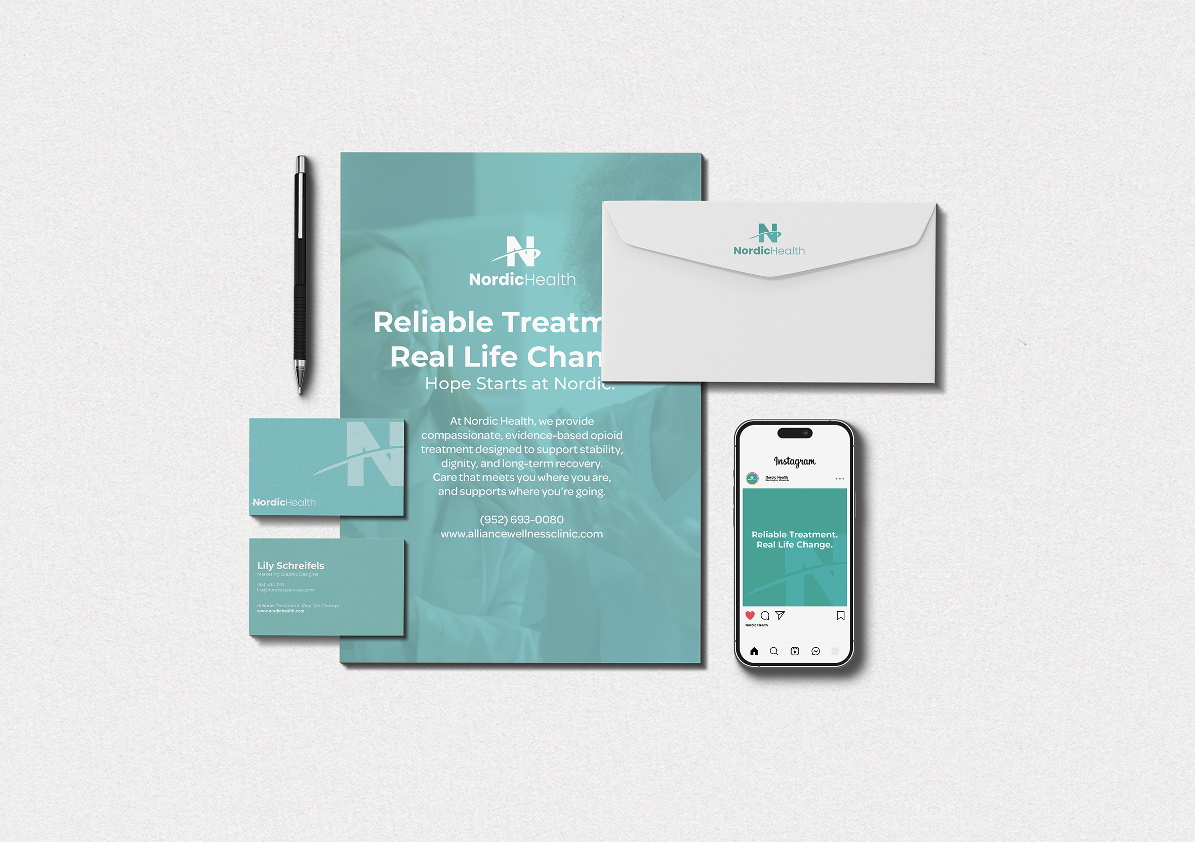
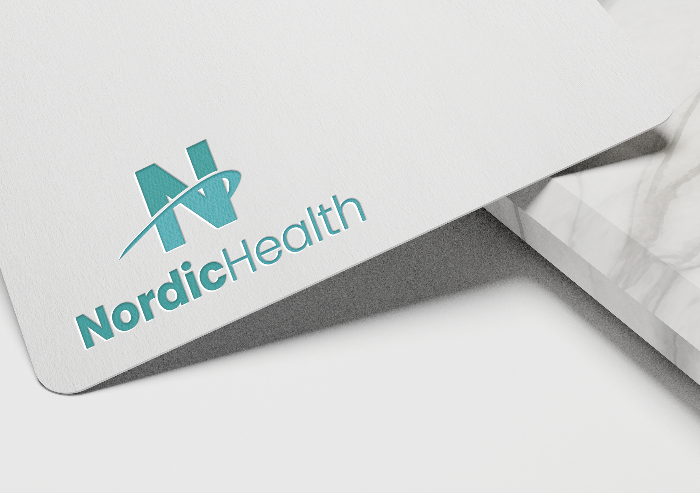
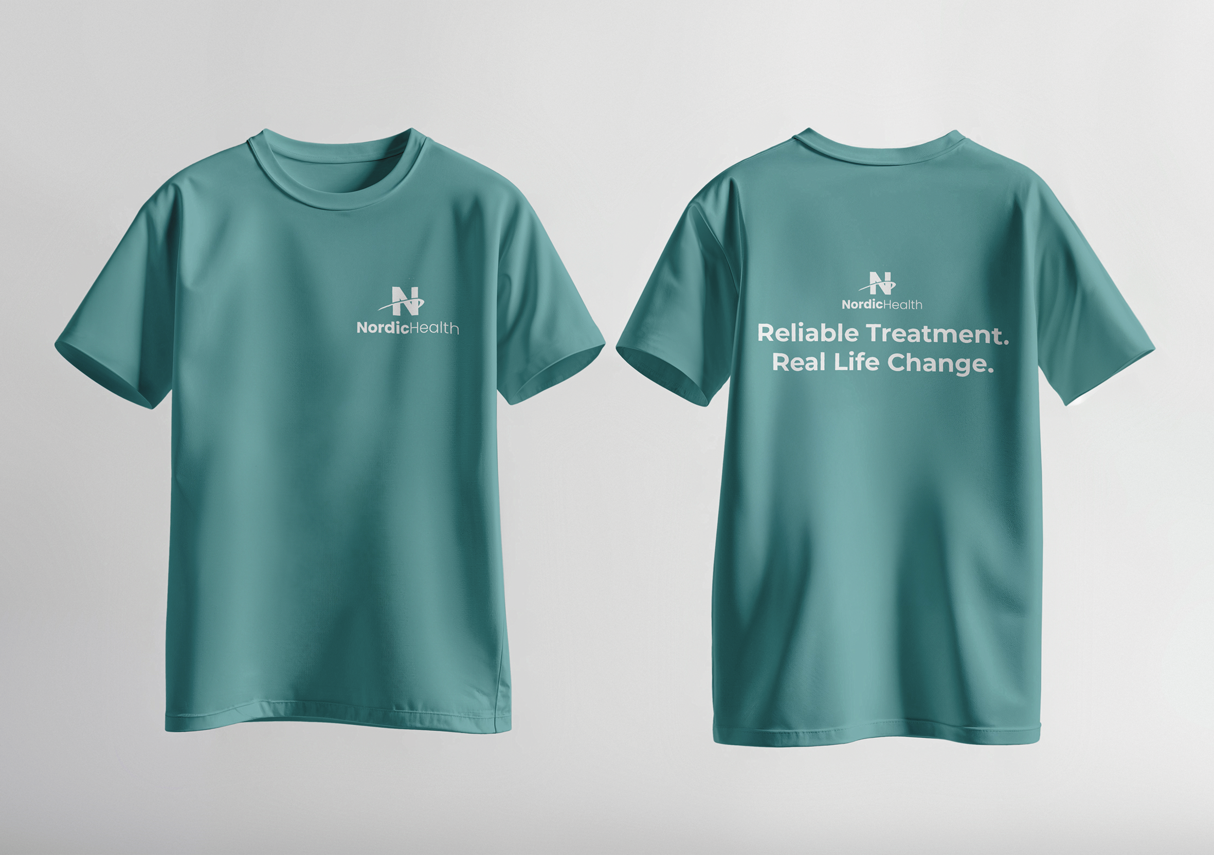
Nordic Health
Logo Design + Branding
Nordic Health is a rebrand of Alliance Wellness Clinic, a methadone clinic in Bloomington that Horowitz Health acquired in early 2025. It was important to the marketing team to establish Nordic Health outside the negative stereotypes associated with methadone clinics. The medical discrimination within these specific services was something we wanted to avoid association with. Nordic Health is committed to creating a welcoming, judgement-free space.
I approached this project by first learning more about methadone clinics and the criticism they receive. My research confirmed that despite the stigma, their importance for those in recovery is tremendous. People who are going to these clinics are looking for a fresh start, and a safe space, and their courage should be met with respect. I then spent time concepting a variety of different ideas, trying out various logo marks,
incorporating the words, etc. - all in an effort to reflect Nordic Health’s commitment to patient care in the visual elements.