Fifth Third Bank
Logo Redesign
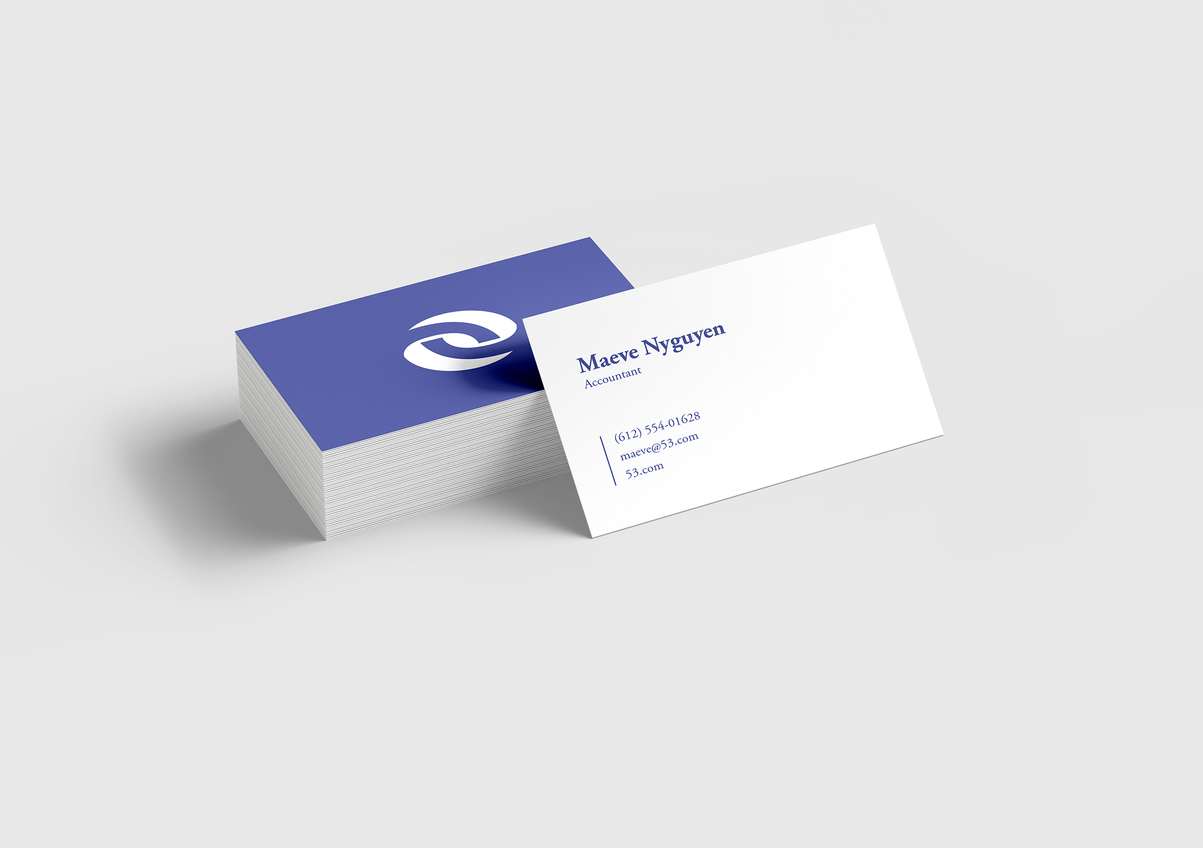
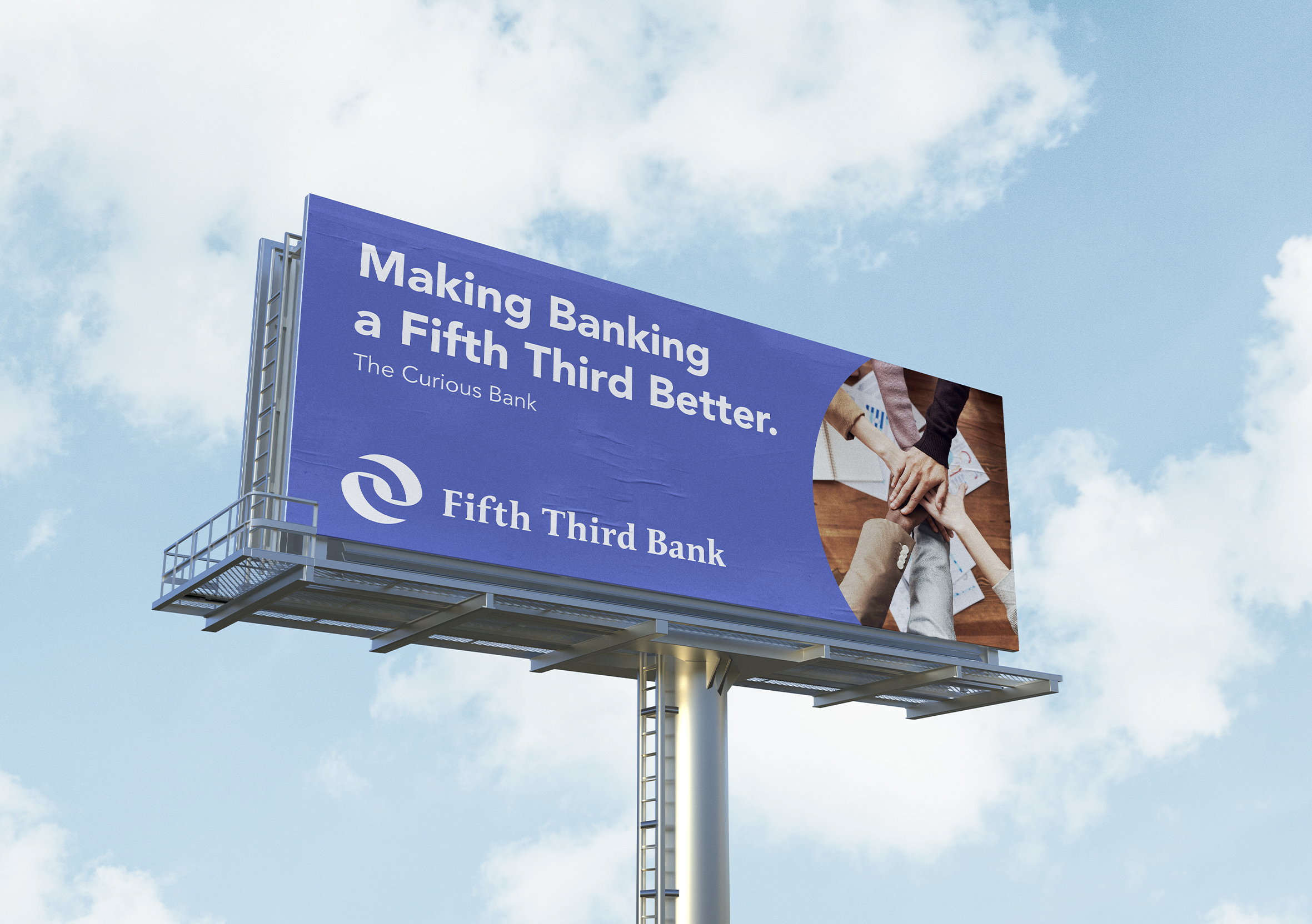
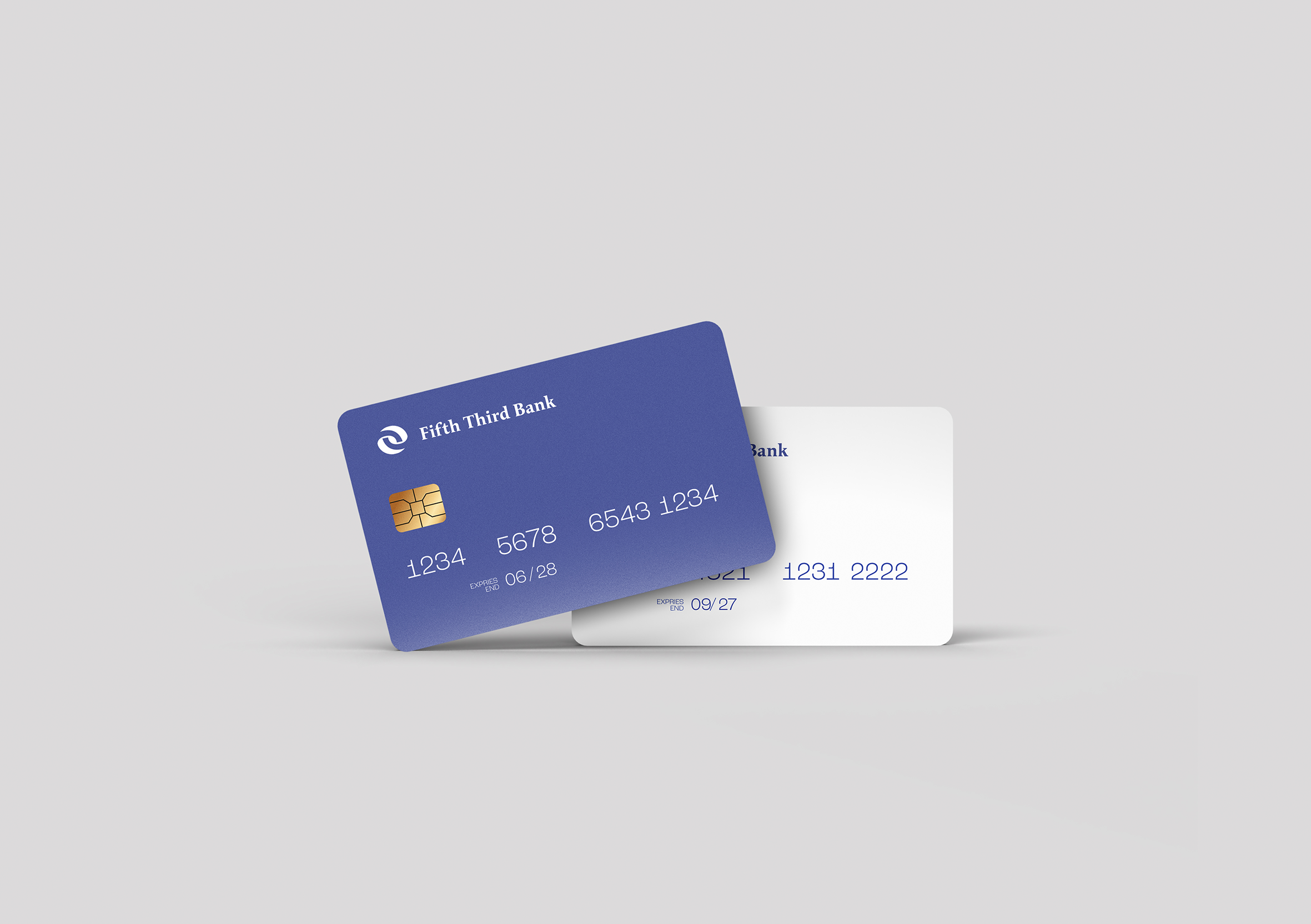
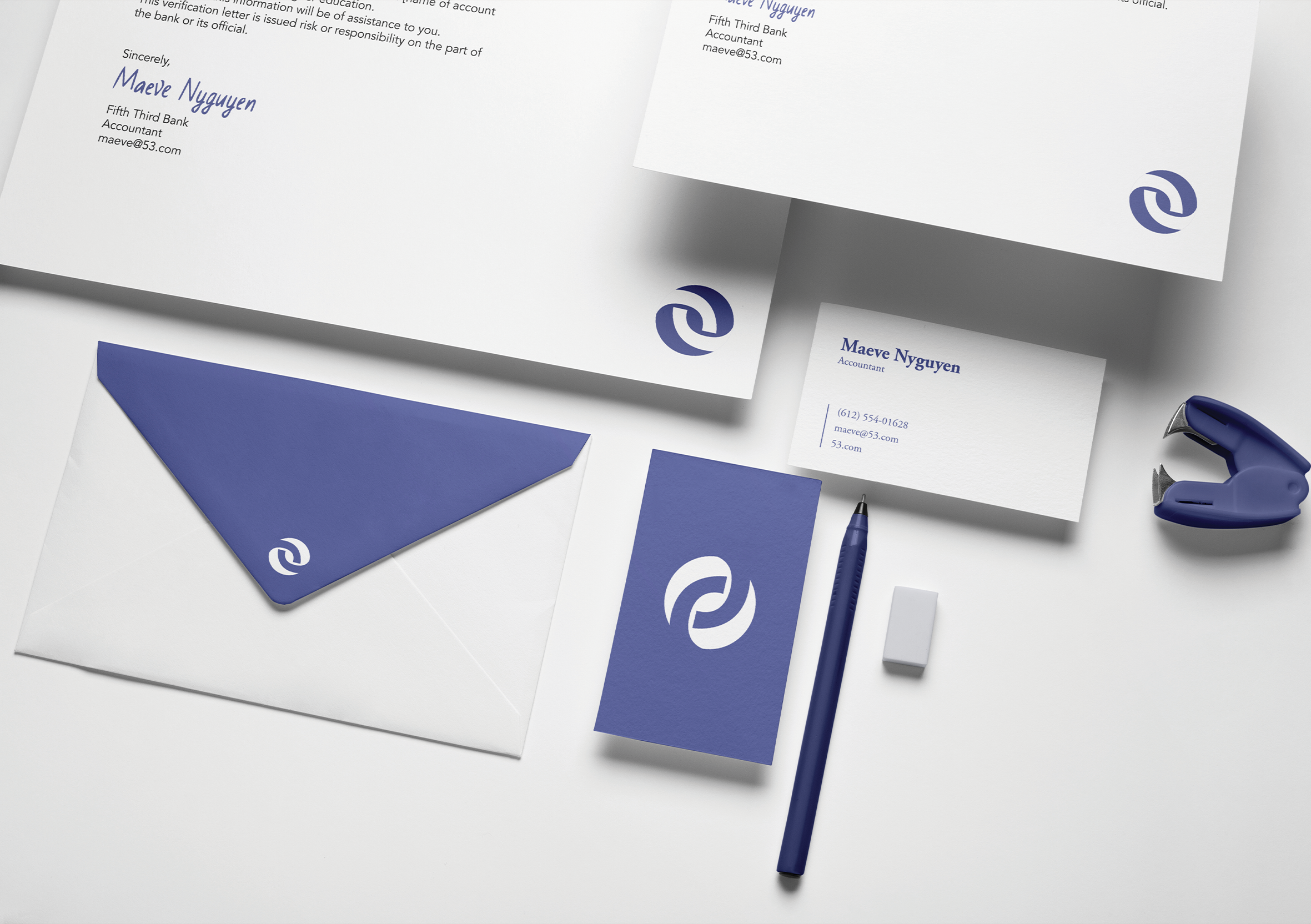
Fifth Third Bank is deeply committed to its community, and they wanted a logo that reflects this connection with their customers. In focusing on the theme of connection, the logo shows two shapes coming together, symbolizing their dedication to building and nurturing community bonds. Movement in the design creates an emphasis on the fluid nature of connection and the cyclicality of community. The bold typeface embodies the confidence that financial tools can give individuals and organizations as they work to achieve their goals.
This was a mock project during my first year at Dunwoody
Concepts
After researching Fifth Third Bank, it was their core value of community outreach that stood out to me the most. I wanted to portray this more clearly than their previous logo and branding.
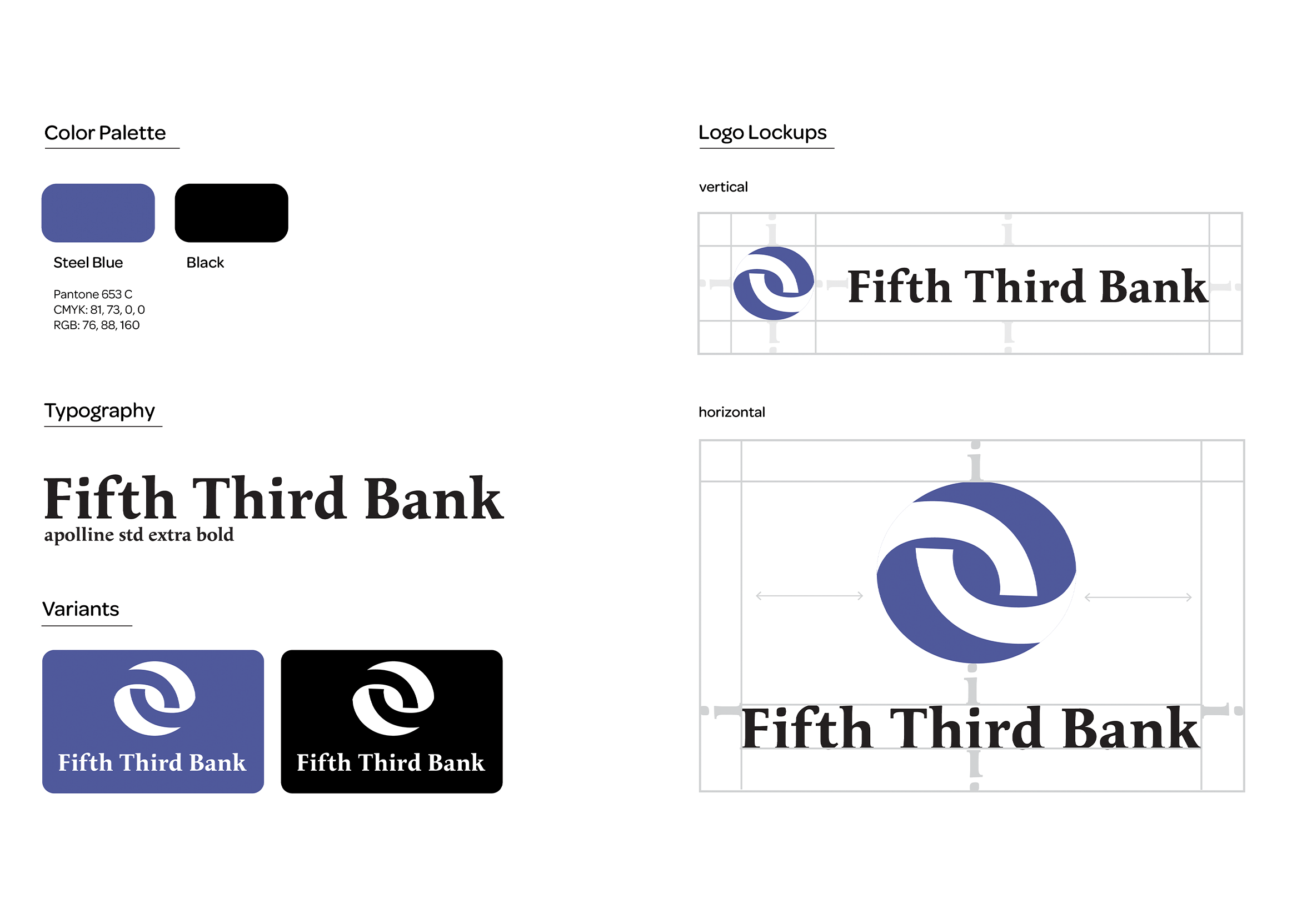
I began the design process by playing around with the shape of the numbers five and three, as well as the words themselves. The shapes I created from that work led to the final logo mark - born from making the shape of a connecting chain.
My client and I chose a deep, bold blue for the logo. According to color theory, blue inspires feelings of loyalty, which is a crucial emotion to evoke for a bank building trust with their community.